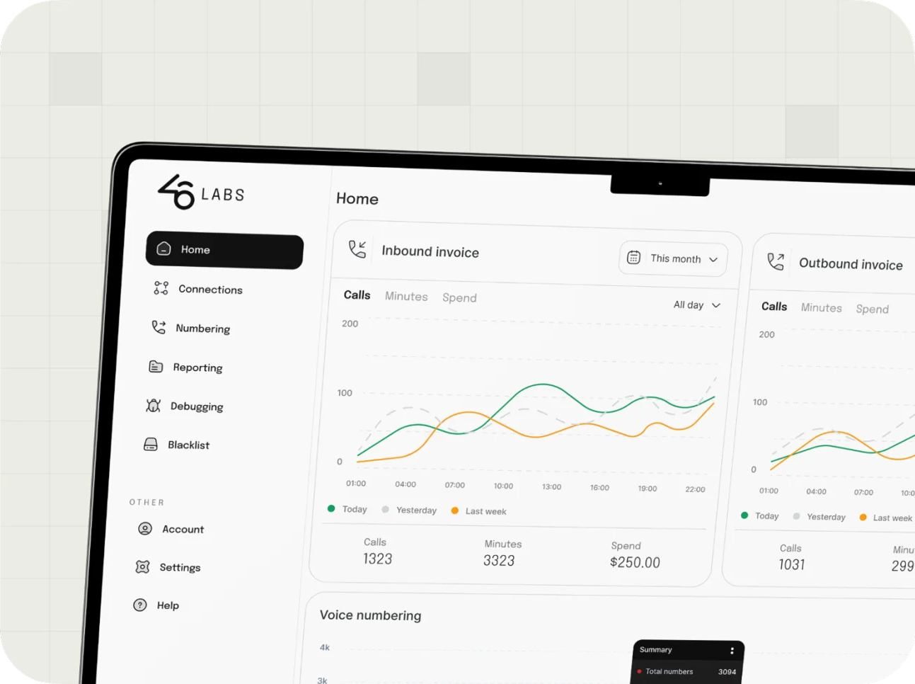
46Labs
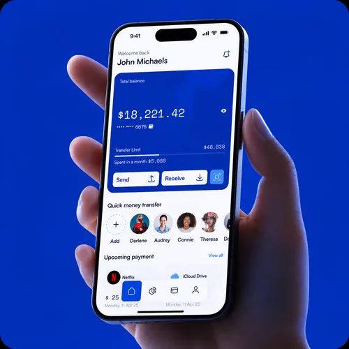
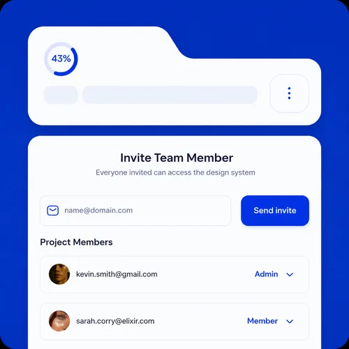
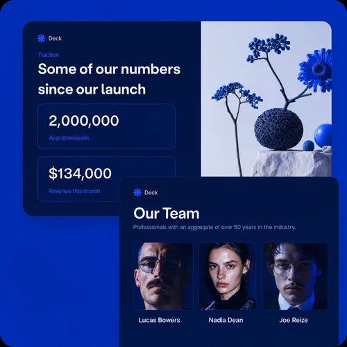
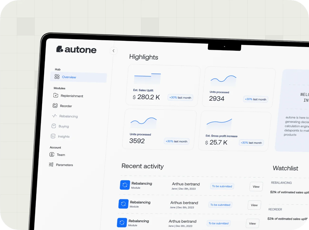
We’ve created three distinct dashboard app solutions and developed the strategy for the pitch and investor decks, produced an explainer video and developed marketing materials for social media use.

Turn data into decisions
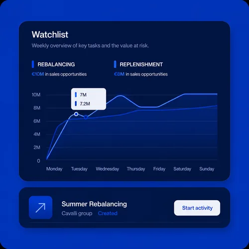
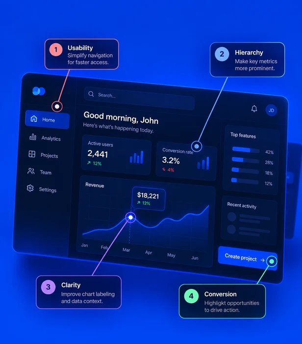
A dashboard is a decision interface. We transform metrics, tables and workflows into products people can understand quickly and act on with confidence.
Let's collaborate
What we know
You can measure how effective the design for a dashboard is if it helps you reduce decision-making time by up to 30–50% by making critical data instantly accessible and easy to interpret.
Slow Decision-Making
Operational Inefficiencies
Poor Forecasting
Increased Risk of Errors
The winning formula
01
We start by identifying who will use the dashboard, what decisions they need to make and which metrics matter most.
02
We organize the information with clear hierarchy, logical groupings and visuals that match the data type.
03
We design the interface, test it with real users and iterate to ensure clarity, usability and high performance.
Main deliverable
Complimentary deliverables & services
We’ve created three distinct dashboard app solutions and developed the strategy for the pitch and investor decks, produced an explainer video and developed marketing materials for social media use.
We redesigned a core dashboard platform to support business metrics, save users time, reduce errors and improve operational efficiency across daily workflows.

ADS advantage
We do not only make dashboards look better. We make them easier to understand, easier to build and easier to scale across the product.
Start a ProjectFAQ
Most focused dashboard projects take four to six weeks. Larger platforms with multiple roles, data sources or permission levels are scoped in phases so the work stays clear.
Yes. We can design inside your current system, extend it where the dashboard needs new patterns, or create the core components if you do not have a system yet.
Real data helps, but it is not required on day one. We can begin with sample data, existing reports, spreadsheets or screenshots and refine the structure as access improves.
Yes. The final handoff includes annotated screens, interaction notes, reusable components and the logic behind each chart or table.