Hostelworld
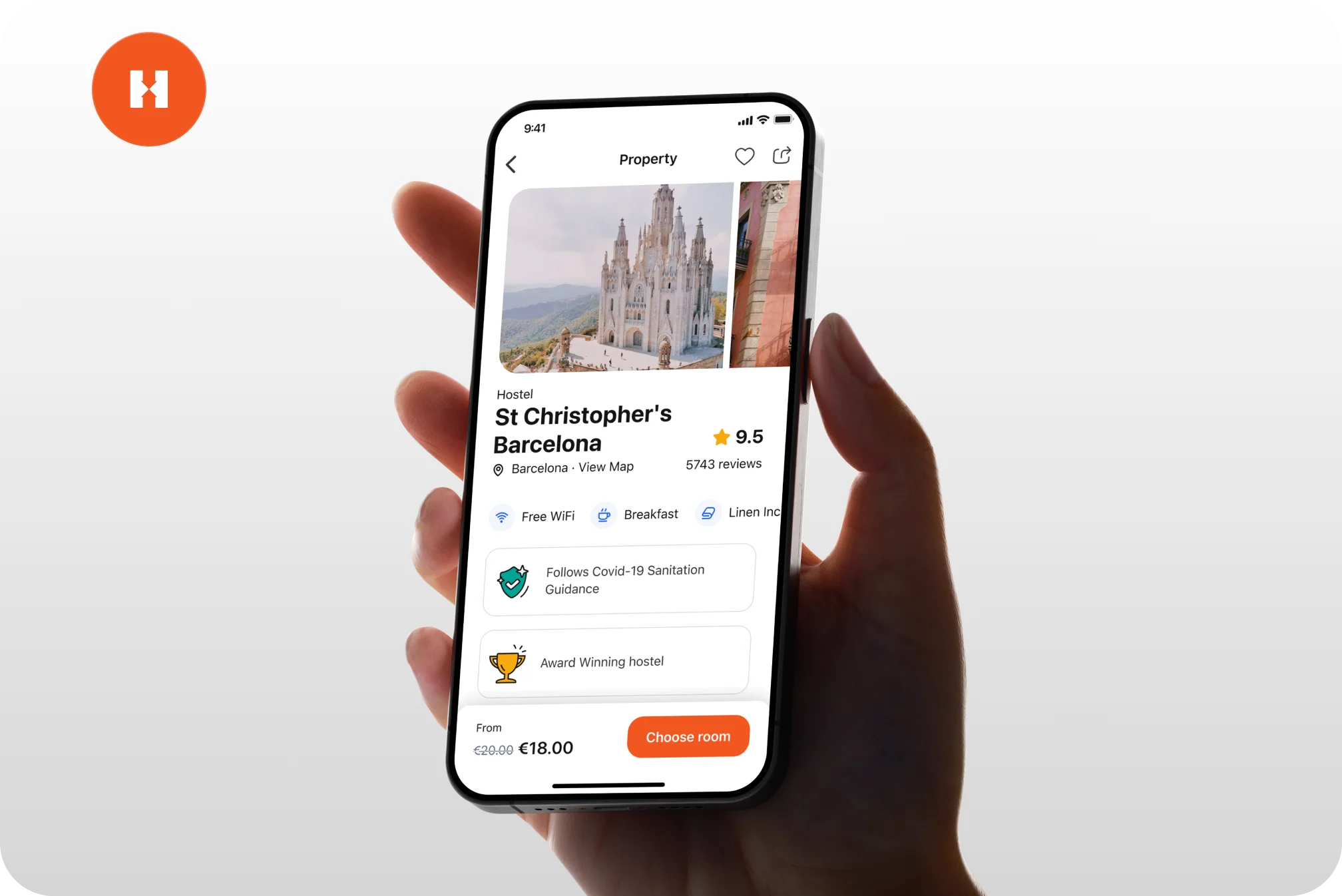
We supported their full product strategy, created a clear design system to remove guesswork, defined all design rules and redesigned their entire ecosystem: from mobile and web apps to their website.
HO
Small screens, big impact
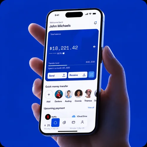
On mobile you get one thumb, a small screen and a few seconds of attention. We design apps that work inside those limits — the ones people keep on the first page instead of deleting after a week.
What we know
A good mobile app respects the context it is used in: standing on a train, one hand busy, signal dropping. That means the important action sits within thumb reach, the app tells you what is happening while it loads, and nothing important hides behind a gesture nobody discovers. Get that wrong and people do not file a complaint — they just leave a one-star review and uninstall.
Mobile app design
clarity map
Signal 01
People abandon it
Needs claritySignal 02
Ratings drop
Needs clarityImprove the flow
People abandon it
Onboarding asks too much before showing any value, and the install never becomes a user.
Ratings drop
Frustration goes public in the store, where it deters everyone who reads before downloading.
Retention fades
The app gets opened a few times, never becomes a habit, and quietly stops being used.
Rivals win
Switching costs on mobile are one tap, and a smoother competitor takes the user for good.
We get to know the people who will use this — how they think, what they need, and where the app fits into an ordinary day.
We design touch-first interfaces where targets are easy to hit, motion explains what just happened, and each screen has one clear job.
We put it on real devices in real hands, watch where thumbs hesitate, and refine until it holds up at every tap.
Main deliverable
Complimentary deliverables & services
We supported their full product strategy, created a clear design system to remove guesswork, defined all design rules and redesigned their entire ecosystem: from mobile and web apps to their website.
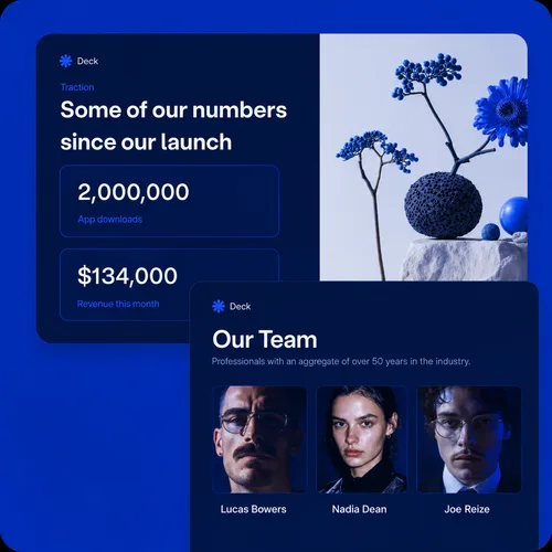
We've created three distinct dashboard app solutions and developed the strategy for the pitch and investor decks, produced an explainer video and developed marketing materials for social media use.
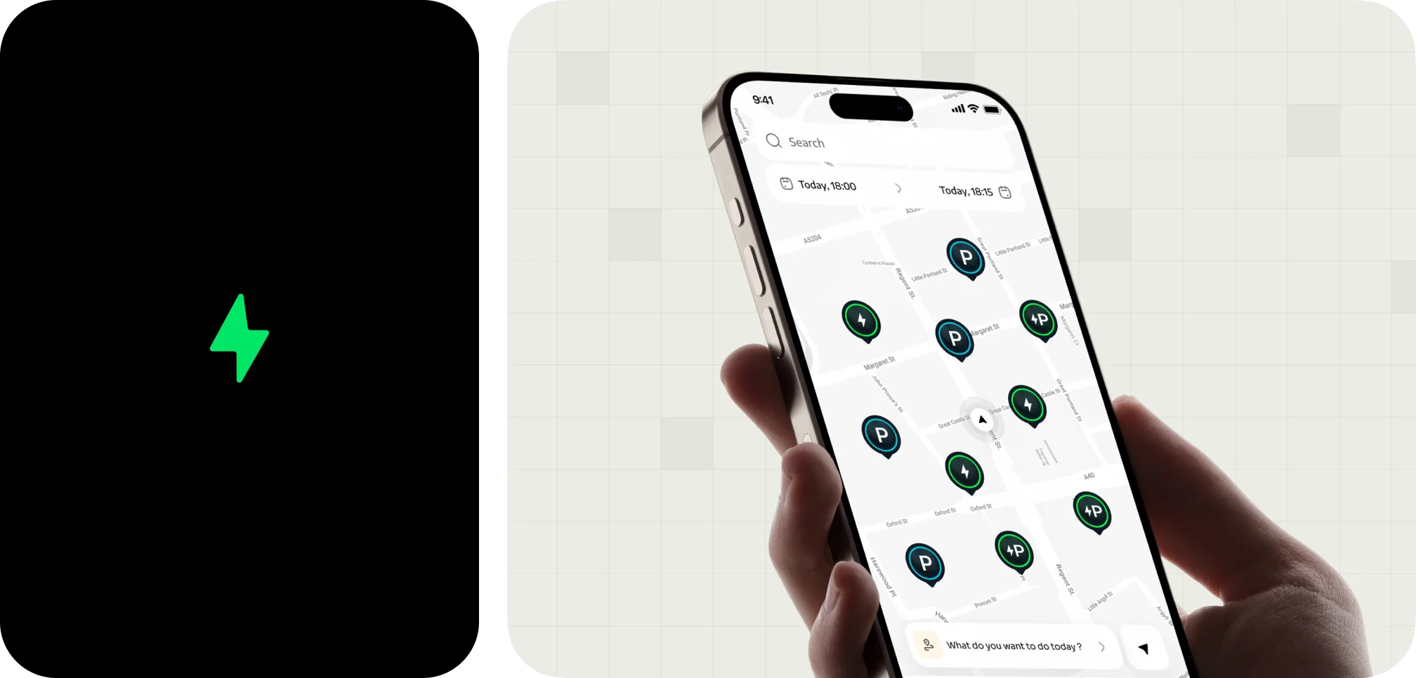
We reimagined the mobile experience to make finding and scheduling EV charging or parking spots more intuitive, while improving reviews and supporting station activity through a unified dashboard.
Key metrics
Completed projects all around the world.
Capital raised by our startup partners.
Users reached with products designed by us.
Over a decade of experience in delivering impactful digital solutions.
FAQ
We design one product with the platform conventions each side expects — navigation, system components and gestures follow the platform rather than fighting it. Where the two genuinely differ, you get both; where they do not, we keep it shared so the system stays small.
A focused app usually runs six to ten weeks: a couple of weeks of discovery, four to six weeks of design, and a stretch for testing and hand-off. Apps with several user types or an accompanying dashboard take longer, and we scope that before starting.
Yes. We start with what the store reviews and your analytics already tell you, map where people drop off, and stage the redesign so your team can ship it in releases rather than one risky rewrite.
Store screenshots and the visual side of the listing are part of the deliverables. It is the first screen anyone sees, and it decides whether the rest of the work gets a chance.
Tell me what your users need to do on the move, and I'll reply with the next steps within one business day.