Hostelworld
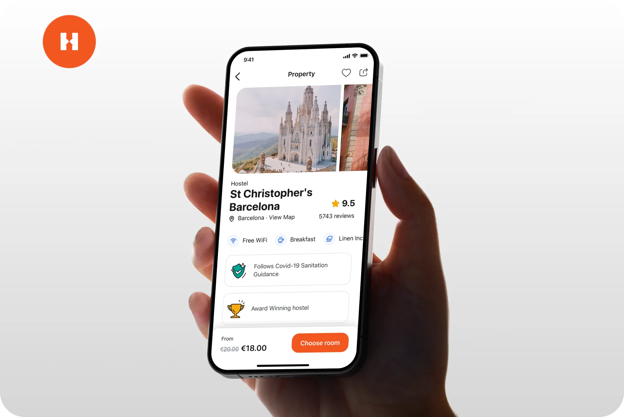
We supported their full product strategy, created a clear design system to remove guesswork, defined all design rules and redesigned their entire ecosystem: from mobile and web apps to their website.
H
Crafted for user clarity
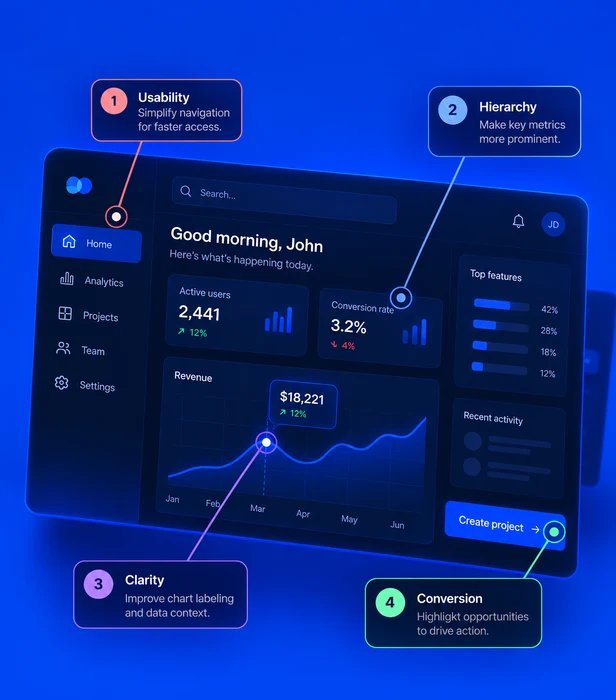
A web app is where your product actually gets used. We shape the structure, the screens and the interactions so people move through the work without stopping to figure out the interface.
What we know
Complexity is not the enemy — confusion is. A strong web app can carry a lot of depth as long as each screen makes the next step obvious. That is what keeps people coming back after the trial ends, and what stops your product from getting heavier every time you ship a feature.
Web app design
clarity map
Signal 01
Users drop off
Needs claritySignal 02
Retention slides
Needs clarityImprove the flow
Users drop off
People abandon the flow at the first screen that makes them stop and think.
Retention slides
The product gets used once, never becomes a habit, and quietly churns.
Conversion stalls
Sign-ups and upgrades leak away in flows with too many steps and too little clarity.
Scaling hurts
Without a system underneath, every new feature makes the interface harder to navigate.
We cut the complexity down to the journeys that matter, and line the design up against what the business actually needs to happen.
Every screen and interaction is built to carry people forward and let them act with confidence rather than caution.
We test with real users, listen to where the friction is, and tune the experience so it holds up as the product grows.
Main deliverable
Complimentary deliverables & services
We supported their full product strategy, created a clear design system to remove guesswork, defined all design rules and redesigned their entire ecosystem: from mobile and web apps to their website.
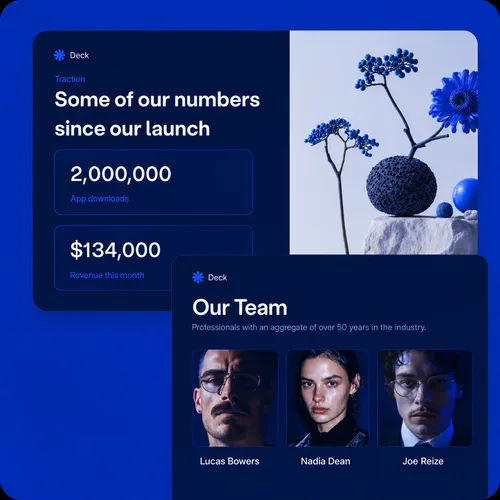
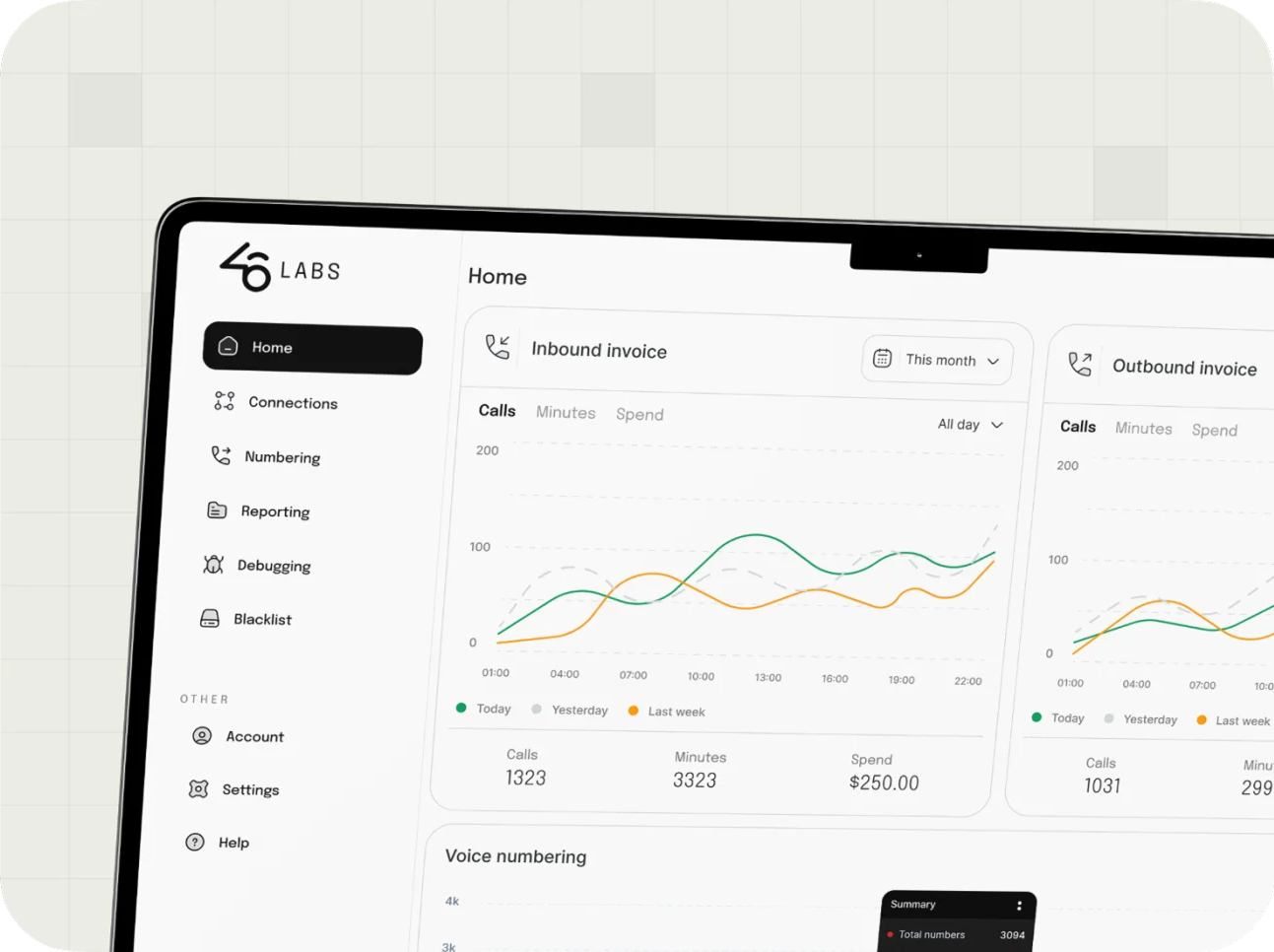
We've created three distinct dashboard app solutions and developed the strategy for the pitch and investor decks, produced an explainer video and developed marketing materials for social media use.

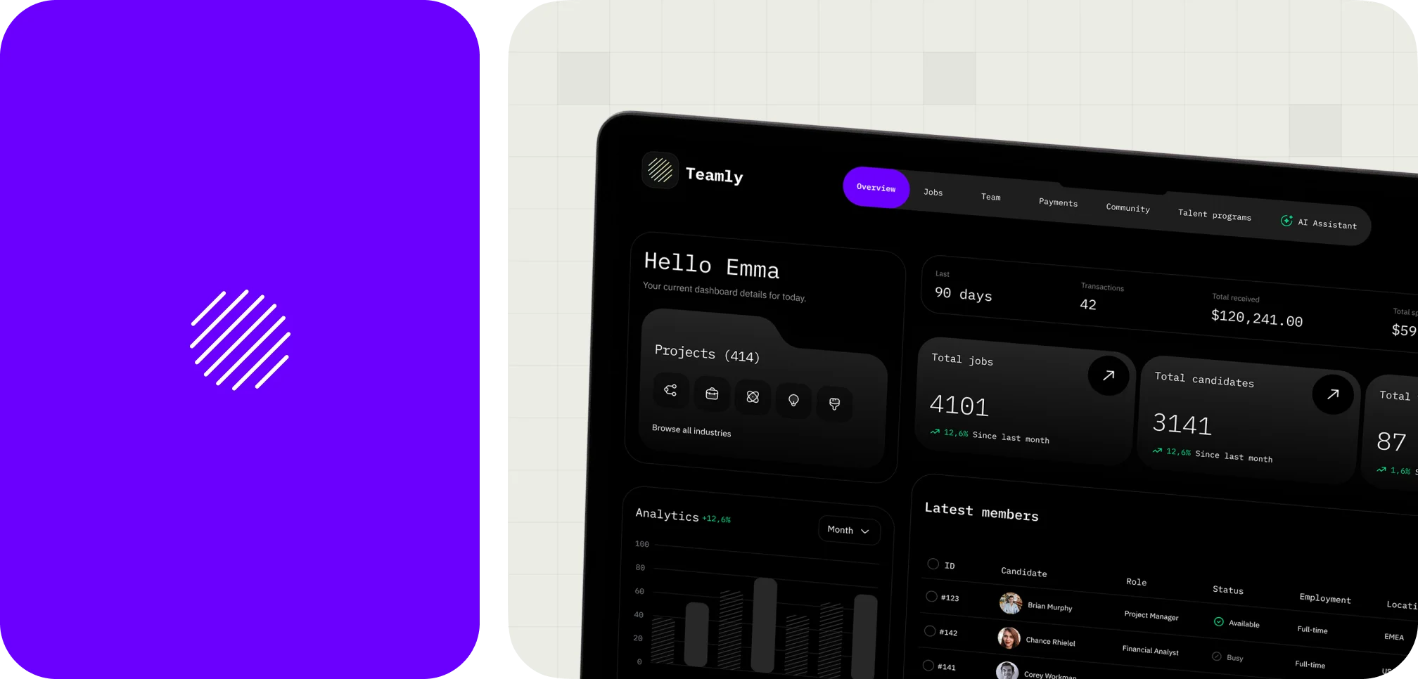
We designed a dashboard web app that streamlines job discovery and applications, using AI to help candidates find relevant roles and build complementary teams.
Key metrics
Completed projects all around the world.
Capital raised by our startup partners.
Users reached with products designed by us.
Over a decade of experience in delivering impactful digital solutions.
FAQ
Most engagements run six to ten weeks: a week or two of strategy, four to six weeks of design, and a final stretch for testing and hand-off. Scope drives it more than anything — a focused product area moves faster than a full platform, and we agree on that before we start.
Yes, and it is a lot of what we do. We start by mapping what already exists and where users struggle, then plan the redesign in stages your team can ship without freezing the roadmap.
Responsive layouts are part of the work. We define how each screen behaves across breakpoints so your engineers are not left guessing what a table or a side panel should do on a narrow viewport.
We review contrast, focus order, keyboard paths and semantics against WCAG as we design, rather than auditing it at the end. It is cheaper to get right early and it makes the product better for everyone.
Tell me what your users need to get done, and I'll reply with the next steps within one business day.